
Logo design for the Wagożercy restaurant
Date of completion:
2024
Scope of implementation:
Logo design
Who is the Client?
Weight Eaters
Wagożercy to sieć restauracji na wagę, która kładzie nacisk na świeżość, jakość produktów oraz przyjemny klimat w lokalach. W Wagożercach każdy posiłek komponowany jest według indywidualnych preferencji gości – to oni decydują, co znajdzie się na ich talerzu, a restauracja gwarantuje, że wszystkie składniki są świeże i starannie wyselekcjonowane. W ofercie znajdują się zarówno pożywne sałatki, soczyste mięsa, jak i aromatyczne dania wegetariańskie, dzięki czemu każdy znajdzie coś dla siebie.
Recognizing the customer's need:
Creating a project is only the end result. In order to properly think through and design an effective project, it is essential to understand the client's needs and the result they want to achieve.
Wagożercy Restaurant needed a unique and recognizable logo that would reflect their values and philosophy. They lacked a coherent graphic element that could be used on their website, social media and promotional materials. They wanted to emphasize the freshness of ingredients, the ability for guests to personalize meals and the pleasant atmosphere of the premises, but the existing materials did not reflect this sufficiently.
Implementation:


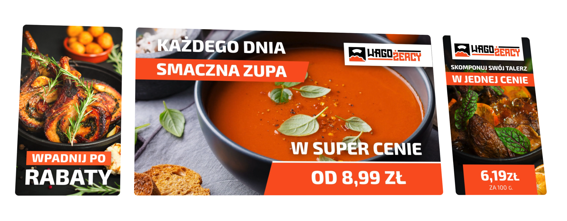

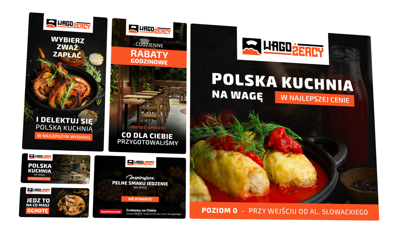
Many large format projects, leaflet, poster and voucher designs
Many advertising projects for the Wagożercy restaurant in Wrocław
2024

All projects for this client:
All projects in this category:


Logo design
Logo design for a company from the pest control, disinfection and rodent control industry
2019


Skontaktuj się ze mną
Case description:
A well-executed project is the sum of many components, such as communication with the client, properly prepared materials, specific project guidelines and interaction with the problem being solved.
I designed a logo for the Wagożercy restaurant that fully reflects its unique character and values. I focused on creating a symbol that combines the elements of freshness, diversity and an individual approach to the customer. I used colors associated with nature and healthy food to emphasize the emphasis on the quality of products. The new logo is modern and eye-catching, thanks to which Wagożercy can communicate their brand more effectively and stand out from the competition. The logo is also universal, which allows it to be used in all communication channels.